Creeping up on Halloween, I might as well get into the spirit with a bit about a dustjacket showcasing one of the many weird carvings crafted by horror and fantasy great Clark Ashton Smith.
My bookman pal Paul Dobish and I were talking about something bookish, which brought to mind a first run dustjacket on an Underwood-Miller book. I realized that he might not know about it, and Dobish is deep into that kind of thing — he discovered that the boards on the Arkham House first edition of Stanley McNail’s poetry collection Something Breathing featured three variants for the cloth covering. First he learned there were two shades of green, and kept at it until he found a third. A fourth? If it exists, Dobish stands most likely among people I know to stumble across the discovery.
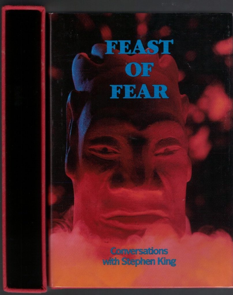
I only know about the first run jacket because I ghost-edited Feast of Fear, interviews with bestseller Stephen King. You’ll find a small credit line that acknowledges I “compiled” that 1989 collection. And as an additional connection to that edition, Tim Underwood asked if he could use one of the Clark Ashton Smith carvings from my personal collection for the cover, for fun.
The limitation page for the U-M first — all boxed in slipcase —reports 600 copies, of which 550 are numbered, 24 are stamped “Presentation Copy” with the final 26 “lettered A-Z and leatherbound.” A trade hardcover followed from Carroll & Graf.
The image at the top features Dobish’s numbered copy — slipcase openside out on the left. He also has one of the 26 lettered copies bound in leather, but those were not issued with a dustjacket.
The jacket on that Dobish copy comes from a second run. Tim was unsatisfied with the first run of the jacket and had them redone.
The image at the bottom shows the first run jacket on the left and the second run jacket — the one generally used for the book — on the right.
The shot of the carving is the same on both, but the placement within the front jacket panel is different.
You’ll notice two discernible points:
The first run of the jacket (on the left) has more space between the carving and the spine edge to the left.
Easier to quickly check, the placement of the sub-title beneath the lips is different, as the carving “moves” in the space. If confused, use a ruler or pencil placed over the images to do a visual line from the corner of the lips down to the words.
On the second run (on the right) all the sub-title wording falls below the lips — none of it projects out to the left.
On the first run both the words “Conversations” and “with” start TO THE LEFT of the left corner of the mouth.
A minor change, but the first placement was driving Tim’s design sense nuts, I guess. Hence, he did another run.
Plunging into the quest, Dobish tells me that most copies of the first of Feast of Fear on ABEBooks feature a “stock image” of the book — but the stock image is of the first run jacket! My understanding when Tim was gave me both states of the jacket was that the one used on the print run would be the “corrected” second state.
If you get in on the hunt for the first state dustwrapper, then, tread with caution.
Another wrinkle to the narrative — which I knew nothing about, because I didn’t receive one of the leather copies — is that while the 26 lettered copies come without dustjackets, on the side of the accompanying slipcase they have tipped-in or pasted the front panel of the otherwise unused first run jacket. Dobish knows this detail because as a book dealer he handled several copies.
I don’t know, but perhaps that’s where the current “stock image” on ABEBooks originated. And I cannot say with certainty that some of the numbered copies may not have gone out into the world in the first state wrapper.
Yeah, another nightmare for Halloween — and hey, arch book collectors love this sort of thing.
Me, thank god I have both states of the jacket on my copies and don’t have to worry about it.