Pulps in the Movies. On Sale Every Wednesday.
Some might fear to spot woodpulp fiction mags in one of the most beloved — and prestigious — movies of all time. Oscar winner for Best Picture. Best Director. Among others.
But not our doughty correspondent John Locke.
He spots a pulp, he reports a pulp — and he tells it like it is:
Godfather II (1974) featured extensive sequences showing how young Vito Corleone became the Don (the Mafia title, not the Herron, though the two may be closely related).
The year was 1917.
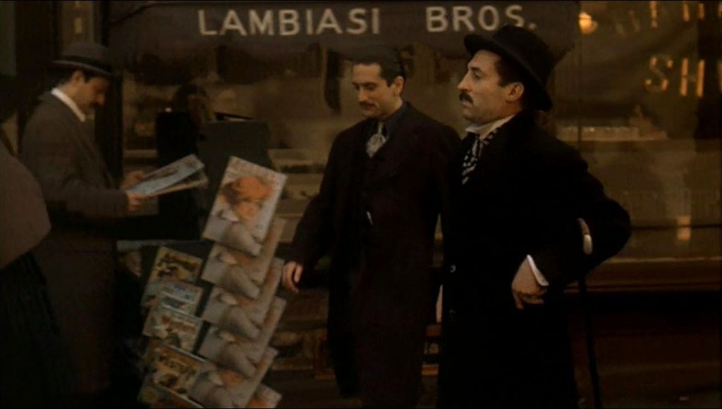
This shot follows Vito’s assassination of Don Fanucci, the Black Hand boss who was the reigning parasite of Little Italy. Note how smartly dressed Vito (Robert De Niro, middle) is now, a clear contrast to his shabby workman’s clothes of previous scenes. He’s cashing in on the power of fear.
Vito passes a newsstand with a sullen landlord who’s just wilted before the suggestion he cut the rent of a poor widowed tenant.
Well, this is embarrassing — not the landlord’s failure to withstand the polite pressure of the dangerous new Don, that is, but the contents of the newsstand.
Here at Pulps in the Movies, we’re enslaved to a high level of exactitude.
One of Godfather II’s six Oscars was for Best Art Direction–Set Decoration.
And now we must give this Oscar an asterisk it can’t refuse.
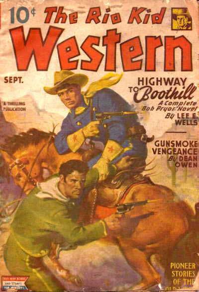
A column of pulps, the left row, adorns the newsstand. Adventure (top), began in 1910, but the issue on display is dated February 1945. The Rio Kid Western (middle) ran from 1939-53, but this issue is for September 1945. (We’re stumped on the western pulp closer to the bottom, though it looks like another 1940s issue. Can anyone help?)
These issues were on sale roughly when Michael Corleone returned from WWII, where The Godfather (1972) begins.
(There’s a second magazine below Adventure. I have no idea what it is. It could even be a dime novel. The fifth mag at the bottom of the stack — impossible to make out with what’s showing. As for the larger mag on the right, they seem to have obscured the logo. It may be a McClure’s, a woman’s mag at that time, but I couldn’t find a matching cover. Clearly mock-ups, given the multiple copies. If you look at the copy the reader is holding, it appears to have a stiffer cover than an actual magazine.)
No doubt, these particular pulps were chosen because their yellow backgrounds pop off the screen better than earlier pulps. Authentic 1917 covers were printed with muted, often dull, colors.
In 1977, Harry Steeger, founder of Popular Publications, who published the 1945 Adventure, was asked about pulp cover colors. His answer:
“There were certain colors and color combinations used on covers which attracted buyers more than other colors. I made a complete study in considerable depth of every color in the artist’s palette. I made all the various combinations possible and then studied them at various distances to note and study the eye appeal. In addition to this, I kept a newsstand in my office and arranged covers on the newsstand to see which ones stood out above the others. This study went on year after year. I became aware of the fact, for instance, that the hot colors like reds and yellows appealed to men, whereas the cooler colors like the greens and the blues and the pastel colors appealed more to women. The magazine covers were planned accordingly.”
Thus, Steeger created the other Yellow Peril in the pulps, a ridiculous proliferation of yellow-background pulp covers.